Color Is a Strategy: How Nashville Brands Are Using Seasonal Palettes to Stay Fresh Without Starting Over
The Color on the Wall Isn't Just Decoration
There's a reason you walk into a boutique on 12South and immediately feel something. The warm terracotta on the shopping bags, the muted sage on the hang tags, the deep plum on the business cards by the register — none of that is accidental. Someone made deliberate choices about color, and those choices are doing real marketing work before a single word gets read.
For Nashville businesses, color isn't just an aesthetic preference. It's a positioning tool. And right now, the businesses that are paying attention to seasonal color forecasting — and actually applying those insights to their print collateral — are the ones that feel current, intentional, and worth paying attention to.
So let's talk about how that actually works.
What Color Forecasting Actually Means for Print
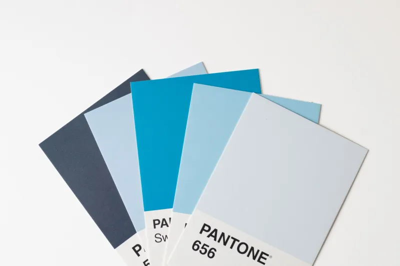
Every year, Pantone releases its Color of the Year, and design communities go a little wild about it. But the real value for business owners isn't the single headline color — it's the broader palette shifts that come with it. Forecasters at Pantone and similar institutions analyze global trends across fashion, interior design, technology, and culture to identify where visual tastes are moving. That information trickles into branding, packaging, retail design, and yes, print.
For 2024 and into 2025, the dominant directions have leaned into warmth and groundedness. Think earthy neutrals, dusty pinks, warm ochres, and deep botanical greens — colors that feel tactile and human in a world that's increasingly digital. That's not a coincidence. There's a collective hunger for things that feel real, physical, and made with care. Print, by its nature, already lives in that space. The right color palette just amplifies it.
Local graphic designers working with Nashville businesses have been quick to pick up on these cues. "Clients used to come in asking for the same navy-and-gold combination year after year," says one East Nashville-based designer who works primarily with food and hospitality brands. "Now they're asking questions about warmth, texture, emotion. The conversation has genuinely shifted."
Nashville's Visual Landscape Is Evolving Fast
Nashville has always had a strong visual identity — neon signs, guitar silhouettes, the glittering excess of Broadway. But the city's brand scene has matured considerably. The wave of independent restaurants, wellness studios, creative agencies, and lifestyle brands that have taken root across neighborhoods like The Gulch, Germantown, and Berry Hill has created a more sophisticated visual culture. Businesses here are increasingly thinking like brands, not just businesses.
That evolution means color trends land differently in Nashville than they might in, say, a more corporate market. There's a creative confidence here, a willingness to lean into personality. When a warm terracotta becomes the season's dominant shade, Nashville brands aren't just following — they're interpreting. They're asking how that color lives on a coaster, a menu, a mailer, a tote bag.
The print side of this is particularly interesting. A seasonal palette refresh doesn't require a full rebrand. It might mean updating the secondary colors on your business cards, introducing a new accent hue to your brochure design, or swapping out the background tone on your direct mail pieces. Small moves. Meaningful impact.
When to Refresh and What to Touch First
Here's where a lot of business owners get stuck: they understand that color matters, but they're not sure how to update their materials without everything feeling disconnected or expensive. The good news is that strategic color refreshes don't have to be all-or-nothing.
A few principles that Nashville designers consistently recommend:
Start with your secondary palette. Your primary brand colors — the ones on your logo, your signage, your website — carry the most recognition equity. Those should stay stable. But your secondary colors, the ones used for accents, backgrounds, and supporting graphics, have more flexibility. That's where seasonal trend influence makes the most sense.
Prioritize high-frequency touchpoints. If you're reprinting something every few months anyway — menus, seasonal flyers, event programs, promotional postcards — those are the natural places to introduce updated color direction. You're already paying to reprint; you might as well make it feel current.
Think about how colors feel in print specifically. A color that looks great on a screen can behave very differently on paper. Matte finishes absorb light and make warm tones feel grounded and rich. Glossy finishes amplify saturation. Working with a print partner who understands color matching and finishing options is essential when you're making palette decisions, not optional.
Tie the update to a moment. A color refresh works best when it's anchored to something — a new season, a product launch, an anniversary, a rebrand-lite. It gives the update context and makes it feel intentional rather than random.
The Pantone Conversation Starts Earlier Than You Think
One thing that catches business owners off guard is the timeline. Color forecasting happens 18 to 24 months before a trend peaks in mainstream adoption. By the time a color is showing up everywhere — on retail shelves, in magazine spreads, in your competitor's Instagram feed — the design-forward brands have already moved on to the next iteration.
For Nashville businesses that want to stay ahead of the curve rather than chasing it, that means having the color conversation with your designer or print partner earlier than feels necessary. If you're planning a collateral refresh for spring, you should be talking about it in the fall. If you want your holiday packaging to feel fresh, summer is when those decisions need to happen.
The brands in this city that consistently look polished and current aren't necessarily spending more money. They're planning further ahead and making smarter decisions about where color updates will have the most visible impact.
Color Is a Conversation Your Print Materials Are Already Having
Here's the honest truth: whether you're paying attention to color trends or not, your print materials are already communicating something about where your brand sits in the market. Outdated palettes signal stagnation. Trendy-for-its-own-sake color choices can feel hollow. But a thoughtful, seasonally-aware approach to color — one that honors your brand identity while staying visually relevant — tells customers that you're paying attention. That you care about how you show up.
In a city as visually alive as Nashville, that matters more than most business owners realize.
If you're not sure where your current palette stands, or whether it's time to think about a refresh, that's exactly the kind of conversation we love having at Nash Prints It. Bring us your brand guidelines, your existing materials, your vision for where you want to go — and let's figure out what color can do for you.